Tuesday 25 April 2017

Interim Evaluation

In terms of research, I feel that my work was majorly influenced by the photographers and images that I looked at in my research log, photographers research and image bank. The photographers that I looked at enabled me to see how images actually looked at certain times and how the models would pose or act in front of the camera. For example, Milton Greene's work with Marilyn Monroe influenced my 1950s shoot as I was able to see how she would pose for the camera and then I could ask my own model to replicate this. My image bank, on the other hand, was useful in allowing me to find out different make up and style trends from the different decades, and therefor allowed me to recreate an accurate look in my shoots.

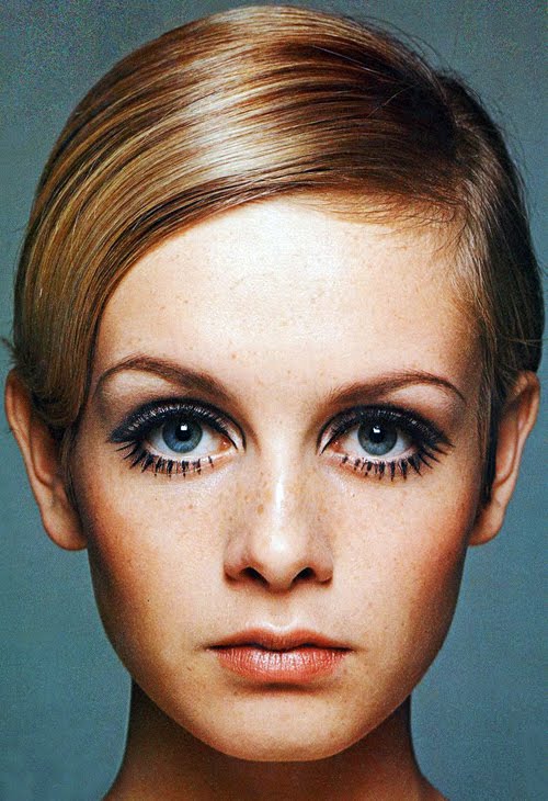
I have gained a couple of new technical and aesthetic insights throughout my preparatory shoots. Firstly, I have used a new form of lighting that I had not used independently before - I used a beauty dish in order to direct light onto my model. I am now confident in setting this type of light up and controlling it on my own, whereas before I had only used this a couple of times and always with supervision. Something I learned to do aesthetically was how to make my images look old and grainy through photoshop. I wanted my images to not only represent a style from a particular decade, but also look as though it had come straight out of it. By using the 'add noise' and 'gaussian blur' tools, as well as others depending on the decade, I was able to make my images appear very grainy and gritty. This helped make them seem old, worn and gave the effect that an old camera was used to capture the images. 

In my next three exam shoots, I plan to work on the decades 1910, 1950 and 2010 as this will allow me to capture the style from 100 years ago, now and then somewhere in the middle. From my preparatory shoots, I plan on carrying on with using a beauty dish as I really enjoyed the depth and shadows that this added to my images. I also plan on recreating the same editing techniques from these shoots in my exam as I really enjoyed the outcome and I feel they were successful in giving the overall effect that I wanted. From my research, I know exactly the kind of looks I hope to create in my shoots. I plan to shoot in the order of 2010s, 1950s and then 1910s so that, in terms of shoot order, it appears as though the viewer will be going back in time to look at the history of make up and fashion.

Connecting Essay 5


This image is a portrait of a woman from the 1920s. I really enjoy the extreme contrast used between her and the background, as her clothing is completely blended into the dark background. As a result, this makes her body and face completely pop and stand out, bringing any focus to this area. The punctum of this image could be the necklace as it really stands out against the woman's skin, and is also the only unique part of this image. Another thing that I find interesting about this image is that it seems to have a colour filter over it as it is not completely black and white - her skin appears to have a yellowish tint to it and makes her appear almost like a statue.


This image was taken from my 1920s shoot. What I enjoy most about this image is the way that she looks directly into the camera, almost making eye contact with whoever is looking. However, she is looking from the side of her eye which I think gives an interesting look to the image. I also like the effect that I managed to create by adding an orange photo filter to the image, which helped to make this image more sepia toned rather than black and white. the lipstick on this image is the punctum as it is quite different from the ordinary way that lipstick is work - it is almost heart shaped. 

Both of these images use a 1920s style to create a portrait - the first was taken at the actual time, whereas mine was taken in 2017. One thing that both of these images have in common is that they both have some kind of colour filter on top. With the first image, there seems to be a yellow tint to it where her skin is, and with my image I used an orangey-brown filter in order to create the old fashioned, sepia effect. The main difference between these photos is the level of contrast - the contrast in the first image is quite extreme whereas in my image, whilst there is a level of contrast, it is not as strong as the first. Another difference I found was the angles of the images - the first one is more of a mid shot whereas mine is a close up.

Connecting Essay 4


This image shows a man sat on the edge of a bed, with his fist under his chin. This is a very editorial style image and is most likely used for some kind of advertisement (e.g clothing). The image was taken in the 00s and so, if this was advertising clothing, this would be a typical 00s outfit for men to wear. It is quite formal as it is a button down shirt, however it has been played down with a pair of jeans. The body language of the man is very relaxed as he is slouched over, staring at the camera.


This image was from my 00s shoot and shows my model sat slightly slouched over as he stares into the camera lens. The way that he looks into the lens would make the viewer feel as though he is looking at them and so would help them to make a connection with the image. The top he is wearing has a tie printed onto it and has been paired with some jeans, and so this outfit is quite casual but also quite typical of mens fashion in the 00s. Not only this, but also the colourful wristbands that he is wearing were quite a big trend - especially with young people - during that decade.

The pose that both of the men in these images hold is almost identical - slightly bent forward, knees apart, looking into the lens of the camera. However, the man in the first image has his fist under his chin, whilst in my image the model has his hands clasped together between his legs. There are quite a few differences between these two images. For starters, the first image is set in a bedroom and appears to be an editorial style image, whereas my image is set in a studio against a black background and appears more natural. Secondly, the first man is dressed quite formally/smart-casual, whereas the outfit worn in my image is more on the casual side. Lastly, there is a narrow depth of field used in the first image. As my image has a plain black background, I decided to keep the depth of field wide.

Connecting Essay 3


This image was taken in the 90s and shows singer Patti Smith, wearing a dark green outfit and stood against a light green background. Although she was a part of the punk rock scene, this photograph of Patti Smith looks very grungey due to the contrasting tones and grainy effect. I think the use of the different tones of green are very interesting as they contrast against each other very well, and also contrast against Patti's skin due to being so bright. I also find it very intriguing the way that she is staring down the lens of the camera, as it makes you feel as though she is looking straight at you.


This image is from my 90s shoot and was themed to look as though it was part of the grunge scene. This is helped by not only the attire that the girl is wearing but also the way that I edited the image so that it was grainy and over exposed as this makes the whole image look gritty. I feel that there is quite a bit of contrast between the model and the background as she is wearing quite bright colours, which pop against the darkness of the background. This could be symbolic of the grunge scene being very fun and unique, which stood out against the rest of society. 

These two images are very similar - firstly, the angle from which they were taken at places the two people in the exact same position in the frame. Whilst their poses may be different, their placement is almost identical which makes the two images pleasing to look at next to each other. Secondly, both images use colour to create contrast. In this first image, this is between the different shades of green and in my image, it is her colourful clothing against the black background. Thirdly is the use of the colour green - whilst in the first image this colour takes up the majority of the frame, in mine the colour green is the one that pops the most as it seems to be the brightest one. There are, however, some differences. Firstly, Patti Smith is stood against a green background. My image uses a black backdrop as the background of the photo. Another difference is in their poses - Patti has a hand on her face whilst she looks straight into the camera lens, wheres my model has her arms to the side as she looks away.

Connecting Essay 2


This image of Twiggy is shot by Barry Lategan, and shows an extreme close up of the model. With this close up, we can really see all the details in her face such as her freckles and the lines in her lips, as well as really getting a look at the iconic lower lashes that were a statement part of her look. As it is so close up, we cannot see anything else in the image and so therefore there is nothing to distract us from looking at her face, making this the focal point of the image. In particular, the viewer is drawn to her eyes. This is not just due to the make up, but also because they are centred in the image and because the whites of her eyes pop so much against the rest of the image.


This image is from my own shoot based on the 1960s, which was clearly majorly influenced by Twiggy's style. With this image, I enjoy that is is a close up so that you can really see her make up and the details in her face, however it is zoomed out enough to be able to also see her outfit and her hair. The way that the model looks straight into the camera lens makes you feel as though she is looking at you, and therefore will make the viewer feel as though they have connected with her. I really enjoy the pop of colour that the dress brings into the image, and this could be argued to be the punctum as the rest of the colours are muted.

The most obvious similarity with these images is the make up. As the aim of my image was to replicate Twiggy's make up, they are very similar in this respect. Another similarity that I found with these two images was the angle - both of these images are close ups. This allows us, with both images, to see even the small details in both of these women's faces and, as a result, see any similarities and differences. The main difference that I would was the colours - whilst Barry Lategan used a bright blue background to make the colours in Twiggy's image pop, I opted for a darker background in order to create a high contrast and make the face of my model stand out. Another difference is that we can only see Twiggy's face and neck - no clothing - whereas my image is taken from slightly further back and so we can see the beginnings of my models dress.

Connecting Essay 1


This photograph of Marilyn Monroe was shot by Milton Greene. There is an interesting contrast in this image as it is quite low - Marilyn's hair and skin appear to be more grey toned - and yet her face still stands out against the rest of the image. The deadpan expression and close up angle allows up to really see the details in her face and really take in her beauty. This photograph gives nothing away about the style of the 50s as she is wearing a plain black, high neck shirt. This is likely a technique used to draw more attention towards her face.


This is one of my images from the 1950s. There is extremely high contrast between the girl's skin as the rest of the image - I purposefully kept this area light in order to create this contrast. This photograph was taken at a mid shot, which allows the viewer to not only see what the models make up is styled like, but also see what her outfit. This is a typical outfit from the 1950s as leather jackets were worn widely within the rockabilly subculture. 

The main similarity between these two images is that they are both black and white portraits of women. Both having been shot against a black background, this makes the woman in both images the main focal point. Another similarity is that both images are in black and white. As Milton Greene's was taken at the time, it is likely to be black and white as this was a trend in photography. My image is black and white as a result of the influence that Milton Greene's work had on my own. This s the main difference between these two images - Milton Greene's image is authentic from the 1950s, however mine is just influenced by the time and is an attempt at replicating their trends. Another difference is that the contrast in my image is extremely high compared to the first image, which appears to be softer.

Monday 24 April 2017

Computer Experiments

Image and Text


Multiple Imagery


Duotone


Black and White


Selective Colour


Friday 21 April 2017

Shoot Six (2000s) - Straight Image


Shoot Six (2000s) - Work Record

Plans For the Shoot

For this shoot, I plan to represent the style of the 2000s. Different from my previous shoots, I will be using a male model for my photos as I have solely focussed on the style of women over the last few decades, and I would like to represent how men dressed also. I have been researching mens style throughout the 2000s and feel that I have a good insight into how my model should dress, and also how my images should look. I will only be adding the smallest amount of train to the images as the 00s saw a progressive increase in the quality of cameras and photographs. I will still be shooting against a black background in order to achieve contrast between the model and his settings.

What I Actually Achieved

I feel that I was successful in achieving images that look how I wanted them to. However, I feel that the use of a male model strays too far from my original proposal as I wanted to mainly explore make up. Whilst my more recent shoots have also explored clothing, they still focussed heavily on make up and I was still able to represent this in my images. This shoot prevented me from being able to do this and so therefore prevented me from following my original brief. Below is an image that I did like and one I did not.


I really enjoyed this image from the shoot. I feel that it includes all aspects of his outfit and really shows what style was like in the 2000s as he has considered all aspects of the way he has dressed. I also enjoy his body language and the way he has posed as this was a popular pose in portraiture from the 2000s and so it helps make the whole image seem like it is from the 00s, not just the outfit.


This was an image I did not like. I feel that the lighting is very off in this image, as his top is very bright and has a lot of light directed in this area, however his face is heavily shadowed. This is the opposite of what I wanted as I want the main focus of the photos from this shoot to be his face - just like the other images - even though it is not focussing on make up. Therefore, I feel that this image is unsuccessful in what I was aiming to achieve.

What I Am Going To do Next

Following this shoot, I will begin my exam. I have decided to focus on the decades 1910, 1950 and 2010 for my three exam shoots as this allows me to get a range of photographs from 100 years ago to now, and a time in the middle. I am happy with my editing from previous shoots and so will follow exactly what I did again, however I may change the outfits/make up slightly to be more representative of the time.

Shoot Six (2000s) - Contact Sheet


Shoot Five (1990s) - Editing Process


1. Adjust the levels so that there is a good amount of lighting and exposure in the image.


2. Further this controlling of light by using the brightness/contrast tool, and dragging the points up and down the bar to were I feel the image looks best.


3. Use the hue/saturation tool so slightly saturate the image, as I felt this helped convey a grungey feel.


4. Use the photo filter tool to add an orange filter to the image - this will create a warm tone to the photograph and create a slightly sepia effect.


5. Use the add noise option to make the image appear grainy and gritty. 


6. To blur this noise and make it appear more like grain than coloured speckles, use the gaussian blur.


7. Add a vignette to the image to make it appear darker and bring more focus to the centre of the image - where there is the most light.

Original Image


Final Image

Shoot Five (1990s) - Straight Image


Shoot Five (1990s) - Work Record

Plans For the Shoot

This shoot will be focussing on the grunge style of the 1990s. I decided to specifically focus on grunge rather than the 90s as a whole as I felt that it was quite a unique style and that it would be an interesting style to represent. I also felt that this look would be interesting to edit as it would go well will with the grainy, over-exposed, warm look that I was planning on creating. I will be shooting this against a black background and will use a beauty dish to really illuminate the model and lift her from the image. I will be adding quite a bit of grain to the photograph as I found that this was quite common with images from the 90s. 

What I Actually Achieved

I feel that this shoot was very successful and has my favourite outcomes so far. In my opinion, I feel that I really captured the style of the 90s in both what was worn and also in terms of editing as the image does have a look that is was taken straight from that decade. I really like how the model posed in the images, as she portrayed the moody and bored look that would easily be associated with youth from the grunge subcultures. I decided to make the images quite over-exposed as this was a common trend that I found when looking at 90s portrait photography. In some images that was very successful and I enjoyed the outcome. However, there were some images where this did not work well due to how the model was stood or how far she was from the light. Below are too examples of where this did and did not work.


This image is, what I feel, the most successful from the shoot. Although there is a lot of blank space around the model, I quite enjoy this as it fills the rest of the image with darkness and therefore draws attention to the model - where there is a lot of colour and lightness. There is clearly high exposure in the image, however I feel that it works really well with the overall look as it is not too much. I also feel that this was helped during editing as I did play with the levels in the image and was able to control the exposure more. I really enjoy the slouched body language and deadpan expression on the girls face as it gives the whole image a moody feel to it.


This image shows where over-exposure was not successful. The light has completely washed the model out and you cannot really see and details in her features as a result. I feel that the overall look of this image is not very visually pleasing and that, as it is so over exposed, the contrast is too high for what I wanted. I also feel that the framing was off in this image as there is so much empty space on either side of her and not much above and so I feel that she seems to drown in the photo.

What I Am Going to Do Next

My next shoot will focus on the 2000s and so will aim to have less grain than my other images as the technology used in that decade is still quite new. Although I originally focussed on the make up of decades, my work has transitioned into looking at the overall style of each decade. As a result I will be using a male in my next shoot as this shift in focus allows me to look at the style of the other gender. I decided to do this as all of my previous shoots have focussed on females and so this will allow me to have some diversity in my work.

Shoot Five (1990s) - Contact Sheet


Shoot Four (1960s) - Straight Image