Thursday 23 March 2017

Shoot Two (1920s) - Straight Image


Shoot Two (1920s) - Work Record

Plans for the Shoot

This shoot will be based on the 1920s. This was a time of very heavy, dark make up and so I will be incorporating this into my shoot. Like the last shoot, I will conduct my shoot against a black background as this will help to increase contrast in my image and therefore bring more attention to the face of my model. In photoshop, I will be adding grain and blurriness to my image - as I did with my last shoot - however this time I will not desaturate it as much and add a sightly orange filter to the image to create a sepia effect. This was something that I found common in portraiture images from the 1920s and so I feel that this will help make my images more accurate. 

What I Actually Achieved

I did not feel that this shoot was as successful. Whilst I feel that I created a make up look that was a good reflection of 1920s trends, I feel that the overall look of the images was not that good. Firstly, I did not style the hair as I planned for my images to just focus on make up. However, when looking at my results, I found that it made the whole image seem off and it made it difficult to decipher what decade that was actually supposed to represent. This was also the case when it came to clothes - I now feel that I should have had the model dress in a way that was similar to the 1920s. Secondly, I felt that the images seemed quite flat as I used soft box lights, which washed out any shadows that existed. Whilst I do not mind how this looks, when I looked at 1920s portraiture, there were a lot of shadows in the images. Below are an image that I did and didn't like.


I felt that this image was the best from my shoot. As it is quite close up, it crops out the clothing and hair that I mentioned did not work well with the look. Not only this, but it makes the sole focus of this image the make up, and helps to really capture the details in the image. I liked the editing from this image as I felt that I got the right balance of colour to create a sepia effect and that I was able to still maintain contrast between the model and the background. Though I used the soft box lights for this image, I was still able to capture a slight shadow under her chin which helps to create more depth.


This image was my least favourite from the shoot. I asked the model to have her eyes closed for this image as I wanted to capture the eyeshadow. However, I feel that it makes the image seem off and not very pleasing to the eye. I also feel that the framing is off in this image as she is slightly off centre, creating a lot of empty space towards the left of the photo. Also with the framing, I feel that I was slightly too close to her face and therefore it is cropped too close.

What I Am Going to Do Next

In my next shoot, I will experiment more with the lighting as I want to create more shadows and depth in my images. To do this, I will most likely explore using a beauty dish as I feel that this will help me achieve the perfect amount of shadows. I will also plan more for how I want the models to look, as before I only planned the make up looks and failed to focus on hair and clothing. This is an element that I really want to work on and so I will therefore ensure that I plan accordingly for the looks.

Shoot Two (1920s) - Contact Sheet


Shoot One (1910s) - Straight Image


Shoot One (1910s) - Work Record

Plans for the Shoot

For my first shoot, I plan to recreate a look that represents the 1910s. This will include some dark shadowing around the eyes and some glossy lipstick, with minimal make up on the actual face (for example, no contouring as this was not a thing in the 1910s). I will shoot my images against a black background as the model I am using has pale skin, which will help create contrast between her and the background. I then plan to edit my photographs in photoshop in a way that will make them appear old and faded - as if the images actually came from this decade. For the 1910s, I will add a lot of grain and slightly blur the image as, at the time, cameras were not of the best quality. I will also desaturate the images to a large extent and add a strong vignette as I found that this was a common occurrence with images from this time. 

What I Actually Achieved

I feel that I was successful in achieving what I hoped to in this shoot. As I was constantly referring back to my image bank and to further images on google, I feel that I created an accurate representation of beauty in the 1910s. However, I did decide to change the look slightly from what I had in my image bank. In my image bank, I discussed how heavy eyes and lips were a common trend in this time. However, when I looked into this further, I found that it was another trend to have softer, paler lips with dark shadowing around the eyes and so I decided to go with this look instead as I felt there would be too much darkness in the image otherwise. I also feel that my editing for this shoot went well as I was able to make it grainy and slightly blurred/softened, which give it the vintage effect I was hoping to achieve. Below is an image that I did and didn't like.


This was my favourite image from my shoot as I feel that it is the most similar to what I was actually hoping to achieve. I think that by having a classic, deadpan portrait like this is good for capturing the style of the model rather than anything else - such as her pose. I also enjoy that it is quite close up as we can really see the details in her face and hair. The dark tones in this image help to create a high contrast as her hair almost blends into the background, helping to bring more attention to her face.


This was an image that I did not like. I felt that, with this image, the framing was slightly off as there is a lot of empty space around her. If this space was filled with something else then it may have looked more visually pleasing, however as it is just a plain black background I think it makes the image look quite boring. I also do not like that she is looking away from the camera as this does not help to catch the attention of the viewer as it makes the model seem disinterested in the shoot. 

What I Am Going to Do Next

Next time, I will be conducting a shoot focussed on the 1920s. In this shoot, I will make sure that the model is looking at the camera and focussing on the shoot the whole time, and I will focus more on my framing as a lot of my images from this shoot, in my opinion, were not framed in an aesthetically pleasing way. I will also try and be more adventurous with the make up look I do and try and make it pop more. Whilst this look was accurate, I feel that it was too plain and so I will try to work on this in  future shoots.

Shoot One (1910s) - Contact Sheet


Wednesday 22 March 2017

Photographers Research - Richard Corman


Richard Corman is an American portrait photographer, who was worked with a wide range of celebrities, including the likes of Michael Jordan, Al Pacino and Nelson Mandela. At the age of 29, he worked as an apprentice to Richard Avedon. Since then, Corman has established himself as a highly successful photography, releasing many books featuring his work. One of his most famous books is Madonna NYC 83, which included a wide range of photos of a 24 year old, pre-fame Madonna. 


This first image of a young Madonna shows her hiding behind the corner of a wall. This could symbolise that she is shy or not ready to face the camera, and so she is trying to hide herself behind this wall. This could also symbolise how she was hidden from view, as this was a time before she was famous.


Very different from the last image, this shows Madonna as a whole as she gives a smirk towards the camera. From this image we can see her wacky fashion and this helps us understand how she was quite a unique person even before she was famous. The fact that she has gone from hiding herself to being entirely on show for the camera suggests that she is relaxed and now comfortable in front of the lens.


This portrait features Muhammad Ali - a world famous boxer. Even if someone was unaware as to who this man is, they could probably infer that he has links to boxing or fighting due his aggressive facial expression and the fact that he has his hands up in a fighting position. There are quite a few tones in this image which creating an interesting amount of contrast, which I find makes this image very eye catching.


This image of Madonna shows her laying down in a dirty, brick filled area - an area which was presumably abandoned as there is nobody or anything nearby. Even though the floor seems to be dusty and dirty, we can see Madonna laying down on it and posing for the camera, and so this could connote her carefree attitude. 

Photographer's Research - Robbie Augspurger


Robbie Augspurger is an American photographer based in Oregon. His most famous series of photographs focuses on recreating looks from the 80s and editing the images in a way which makes them look as though they've been taken straight out of that decade. Augspurger says that he is inspired to make these images by looking through old shoeboxes of family pictures that were taken in the 70s and 80s. The subjects in his images are usually friends or family members, and he gives each model a story for the character that they are portraying.


This image shows a typical outfit that a woman would have worn in the 1980s - a purple blouse with a big bow and big, round glasses. The way that she looks away from the camera as she poses could suggest that she was distracted, or that she was perhaps too shy to look at the camera lens. The purple of the blouse really pops and helps draw in attention on this image.


Again, this shows a typical outfit of the 1980s. This outfit was possibly something that would've been worn by a young person, as the way that the model's hair is styled is quite a young, childish look and so this could portray innocence or being young. Therefore, Augspurger may be trying to portray a childs look through an adult in his work.


This image show a woman with a dog, whilst she is sat in front of an inflated image of the same dog. This could suggest that she is obsessed with the dog and wants to show it off as much as she can. This image focuses more on the relationship between the woman and the dog, however we can still see the influence of the 80s in this womans outfit and also in the way the photo was edited.


This image shows us the technology that was used in the 80s as we can see the big, grey phones that came out during this decade. The fact that this man has no top on could suggest that he had gotten out of bed to answer his phone. This image allows us to see how far technology has developed in the last 30 years as these phones are now very outdated.

Photographer's Research - Alfred Cheney Johnston


Alfred Cheney Johnston was a New York based photographer who lived from the years 1885 - 1971. The work that Johnston was most well known for was his portraits of the Ziegfeld Follies - a group of showgirls who were active in New York from the years 1907 - 1931. Johnston worked with the Follies for around 15 years, whilst maintaining his own successful photo studios around New York City. From then on, he carried on photographing showgirls as well as actors, actresses and products for retail commercials.


This image shows one of the showgirls sitting in front of a black background, holding some flowers. This could signal that it was after a show as she could have collected these flowers whilst on stage. There is strong contrast between the woman and the background as her skin appears very pale against the dark background, which creates an intriguing look and is very aesthetically pleasing.


Again, there is an extremely strong contrast in this image between the pale woman and the black background. This appears to be a common trend with Johnston's work as it helps to make the woman pop in the frame and really helps to keep all attention on her. The fact that she has a sheer back skirt on her bottom half could be a way to keep the focal point as her waist and up, as this is the part of her that stands out the most.


The woman in this photograph is smoking a cigarette, which helps us get an insight into how times have changed in regards to how people view smoking. As this was taken in a studio, this would have been inside and so the woman is smoking inside, which is now illegal in many countries. Not only this, but she is portrayed to be quite glamorous, and so the addition of smoking a cigarette would have possibly, at the time, been quite a glamorous thing to do.


This image shows a younger woman, looking away from the camera whilst she hides her chest with her hand. This could suggest that the woman is shy or perhaps uncomfortable in front of the camera as she will not look at it and is covering herself up. There is high contrast between herself and the black background which, again, helps make her pop in the image.

Photographers Research - Barry Lategan


Barry Lategan is a South African born photographer born in 1935 and is best known for his work with Twiggy - with two of his portraits being exhibited in the V&A Museum in London. Alongside this, he has also photographed notable celebrities such as Princess Anne, Paul McCartney, Calvin Klein and Margaret Thatcher. Lategan has lived and worked all around the world in Cape Town, the UK and the USA. 


This image shows Twiggy with a deadpan expression as she looks ahead - perhaps looking at herself in the mirror. This look that Twiggy is sporting is iconic and what she is most recognisable for - the drawn on lower lashes, slick short hair and everything else being minimal. If she is looking in the mirror, it is perhaps because she is looking to see what others see in her.


This image shows a woman with slick, styled hair and a big fur coat. The style as a whole is very luxurious and so we can assume that this woman is affluent. The way that she looks to the camera from the side almost gives the feeling that the is trying to look away from you or, in a way, looks down on you. This is furthered by the way she is clinging to the fur coat - she is trying to draw attention to this and therefore her wealth.


This is a portrait of Paul McCartney. The heavy amount of the colour green in this image helps to create high contrast against his face and his hat, drawing more attention to this and therefore making it the focal point of the image. The way that he holds the grass in his mouth is the punctum as it is a strange thing to do. The overuse of the colour green and the grass could suggest that he is trying to get back to nature.


Again, this image shows Twiggy when she was most well known and is an example of what she is known for. The way that it is cropped to just show her face implies that this is how she makes her money, and so anything else about her does not need to be shown/identified. The use of the blue background not only makes her stand out against it, but also makes her eyes pop as they are the same colour.

Photographers Research - Milton Greene


Milton Greene is an American photographer who was born on March 14th 1922 and died on August 8th 1985. Greene was a fashion and celebrity photographer and a film and TV producer, who is best known for his shots of Marilyn Monroe. Before beginning his own work, he apprenticed with photographers Eliot Elisofon and Louise Dahl-Wolfe. By the age of 23, Greene was already being referred to as "Colour Photography's Wonder Boy". As mentioned, his most famous work is his series of images featuring Marilyn Monroe. The relationship between Greene and Monroe lasted for four years, and in this time he has photographed her in 52 different locations, spanning a collection of images that was over 5000.


This image shows Marilyn sat in front of a black back drop, smoking a cigarette and holding a guitar. The cardigan she is wearing is quite casual, which is a contradiction of the pictures of Marilyn that people usually see which are quite glamorous. This could suggest that this is how Marilyn looks 'behind the scenes' - when nobody is looking and she could truly be herself. 


Again, this image of Marilyn appears have a lot more of a relaxed vibe than the usual pictures of Marilyn. In this, she is slouched in a wicker chair as she laughs - presumably towards Milton as he takes the picture. The fact that she has a shoe kicked off furthers the suggestion that this is Marilyn is relaxed as to 'kick your shoes off' is to come home and relax after a long day. From that, we could guess that this may have been taken after a day of filming or an event. The blue colours in this image are extremely vibrant and pop, which really captures the viewers eye.


The red colour on Marilyn's lips really pops when compared to the white of the rest of the image. The use of white could be symbolic of purity or innocence, as there are only a few flecks of colour in this photograph. The way that she smiles at the camera with her hands under her chin makes her appear youthful and cheeky, which works well with the suggestion of innocence.


It appears that Milton was able to capture many pictures of Marilyn when she is not made it and posing for paparazzi, as in this image she is completely her natural self - no make up and wet hair as she relaxes in the swimming pool. This is Marilyn at her purest self, and so this could suggest that Milton was extremely close to her and that she trusted him a lot as she was able to be completely natural around him.

Tuesday 21 March 2017

Research Log

Ruth Rose

http://ruthrose.co.uk


This image uses low-key lighting to capture a portrait of this woman. The light seems to be directed from above right as it catches and highlights the high points of her face/body, including her cheekbone and shoulder. We can tell it is coming from the right as the left side of the image has a lot more shadows than the right, which obscures half of her face and the majority of her body. This creates some mystery within the image as it seems as though she is trying to hide herself.


Opposite to the image above, this image uses high key lighting and pale/light tones to create a softer effect to the picture. The girl in the image is wearing a bright orange lipstick, which draws your attention to this part of the image. This could considered the punctum of the image as it pops dramatically against the light tones of the rest of the image.

Jenn Collins

http://jenn-collins.com


This image uses a black backdrop in order to create strong contrast against the woman's pale skin as this really makes the woman pop in the image. The light seems to be coming from in front of her, fro the left of the frame as the high points of her face are highlighted on this side, whereas the other side of her face has quite a lot of shadows. I find it interesting how her dark hair seems to blend into the dark background, and so it is almost hard to make out.


The same technique has been applied here as the image above, where a light background has been used to create contrast with the woman's darker skin tone. As the image is more high key, there is less contrast than the image above. However, we can tell the light is directed from above from the way that the woman's cheekbones and chin are highlighted. I really enjoy the subtle pop that the green eyeshadow gives to this image as it is not overly bright, however it is enough to attract attention.

Milton Greene

http://www.immortalmarilyn.com/milton-greene/


This image of Marilyn Monroe is a classic example of make-up trends in the 1950s. The use of a dark background and dark clothing draws all attention towards her face, which helps to portray and represent style and beauty in this time. This was a classic look of the 50s, a trend which Marilyn Monroe amplified, with her iconic beauty mark on her cheek.


This image, another one featuring Marilyn Monroe, is taken at a mid shot and shows her wearing a white dress. This therefore showcases her whole style rather than just her make up, and symbolises her classic white dress. Even though the image is in black and white, we can still get a sense of her style and make up as the details are similar to the image above.

Alfred Cheney Johnston

https://en.wikipedia.org/wiki/Alfred_Cheney_Johnston


I really enjoy the use of tones in this image as there is high contrast between the woman's pale face and white scarf and the black background. This helps to draw more attention towards the woman's face and therefore her make up/hair. This is also helped by the fact that we cannot see her outfit due to the dark tones and the fact that the light seems to be directed towards her face.


This image, on the other hand, seems to focus more on the woman's outfit/style rather than her make up or hair. Again, this is a result of the tones used as there is not so much contrast between her skin and her clothing/the background, meaning that attention is not drawn away from one aspect of the image. Although the woman's dress blends into the background with the dark tones, the way that her face is turned away makes us look towards her clothes instead - particularly her necklace which seems to be the statement piece of the image and could be argued to be the punctum as it is quite unique agains the rest of the simple image.

Robbie Augspurger

http://www.robbieaugspurger.com


This image has high contrast of colours with the woman's jacket compared to the rest of the image. The background and woman's skin are quite dull in colour and there is an extremely dark vignette added to the image to make the image appear older and more washed out. Even still, the jacket the woman is wearing is extremely vibrant and connotes how bright and fun fashion was in the 80s. It also brings some fun to quite a formally posed image.


Like the image above, this photo also uses clothing to add some colour and fun into an otherwise saturated and dark image. The addition of the dark vignette brings more attention to the centre of the image - where her face is - however the most attention is drawn to the woman's vest top as it is quite vibrant and has a fun pattern of palm trees. This could connote the want for adventure and desire to visit sunny places as it has been turned into a fashion.

Richard Corman

http://www.richardcorman.com


This portrait of Madonna captures her unique style during the year of 1983. This shows a more alternative style that was popular throughout the 80s - for example, her multiple leather bracelets. This image focuses more on her outfit than her make up, but it is still clear how she did her make up and therefore what was popular in this time. The way that she has her hand on her face could suggest that she is shy and perhaps trying to hide from the camera.


Again, in this image, Madonna has the stacked leather wristbands which represents her alternative and quite 'punk' style. In this photograph, she seems more open towards the camera as she has her whole face on show and is staring straight into the camera. This could suggest that, throughout the shoot, she became more relaxed in front of the camera and was more comfortable within herself.

Wiissa

http://www.wiissa.com


The girl in this photograph is dressed in a style that reflects what was popular in the 90s. The way that her body is so relaxed and she seems completely chilled suggests that she is completely comfortable in front of the camera. The red benches that she is sat on are similar to bleachers often found in high schools, and so this could be symbolic of youth and their own unique sense of style.


Much like the image above, this photograph focuses on the fashion of the girl instead of her make up, however we can still see that she has very natural make up and that her clothing is the statement of her look. Again, this image seems to be very relaxed as the girl is sat on the floor with her legs crossed. The bottle in her hand could be symbolic of youth and rebellion as it looks similar to a bottle of alcohol.

Rossella Vanon

http://www.rvanonphotography.com


This photograph is very simplistic as the girl has quite natural makeup and is not wearing any clothes. Alongside this, the colours used are quite muted and so there is not particular colour in this image that pops. However, her hair has been styled very uniquely, drawing attention towards this area and making it the punctum of the image. This is quite unique as it focuses on the hair rather than the make up or clothing and therefore this could imply that there are many ways to express yourself with beauty.


The way that colours have been used in this photograph is very interesting and creates a high contrast that attracts attention towards the girl's eyes. The fact that the girl's skin and hair are both similar pale shades works very well against the bright blues, pinks and purples on her face. This style of make up is the punctum of the image as it pops so much. This could suggest how make up is a way of expressing yourself and how there are no limits to what looks you can create.

Barry Lategan

http://www.peterfetterman.com/artists/barry-lategan


The is an extremely high contrast in this image which really draws your attention towards Twiggy's face and symbolises how her face is primarily what she is known for. Her style in this photograph is quite unique and alternative to what was popular at the time. The use of the shapeless, black dress could be a way of drawing more attention towards her face. The large plait is the punctum of the image as it seems strange against the otherwise simple photograph, and as Twiggy is often known for her short hair.


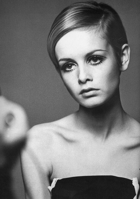
This image helps show Twiggy's iconic make up look, which included the black lines under her eyes as her bottom lashes. This part of her look is possibly the punctum of the image as this look is quite unique compared to the rest of her style, which is quite simple. Again, the focus seems to be on her face and so this image represents why Twiggy is famous.

Robin Li

http://www.ruobingliphotography.com


This image uses extremely high key lighting, which helps to show all of the details on the model and almost creates a glow on her skin. The image is very simple in colours and also styling, with the bright red lipstick appearing extremely vibrant and popping in the image. This is definitely the punctum of the image as it stands out so much and is so vibrant against the otherwise quiet saturated image.


Again, this image uses simple make up and extremely high key lighting to make the punctum of this image really pop. In this case, the punctum is the dark black eyeliner and the long bottom lashes. This really helps to draw the viewer's attention towards her eyes and makes you feel as though she is staring straight at you.